Instructional Design: Holter Monitor Use Guide
Goal: Redesign a manual for outpatient use of a Holter monitor. Create a use guide for the device that allows patients to easily understand why they have been given the device, how to use and maintain the device, record symptom details, and return the device when monitoring is complete.
Tools
Figma
Year
2024-2025
Developed for
The International Institute for Information Design


In this project, I was selected to work with a team of senior Information Design students to complete a project for the International Institute for Information Design’s IID Studio initiative presentation series: “Make Healthcare Information Usable”. We were given the opportunity to identify an information design problem within the healthcare space and use design to address the issue. Our team chose to redesign a take-home manual that is given to patients using a Holter monitor for at-home monitoring at Mazankowski Alberta Heart Institute. Our solution was presented to IIID board members and healthcare design experts, and will be displayed at several international information design conferences.
Design Process
Research
Once we had identified the challenge we wanted to take on for this project, we began conducting research. We completed desk research, subject matter expert interviews, and a sample analysis.

Prototyping

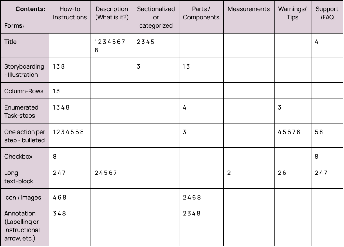
Finally, we completed a sample analysis of existing user manuals for Holter monitors to get a sense of the most common elements found in this kind of document and what information is typically included.

Final Product:

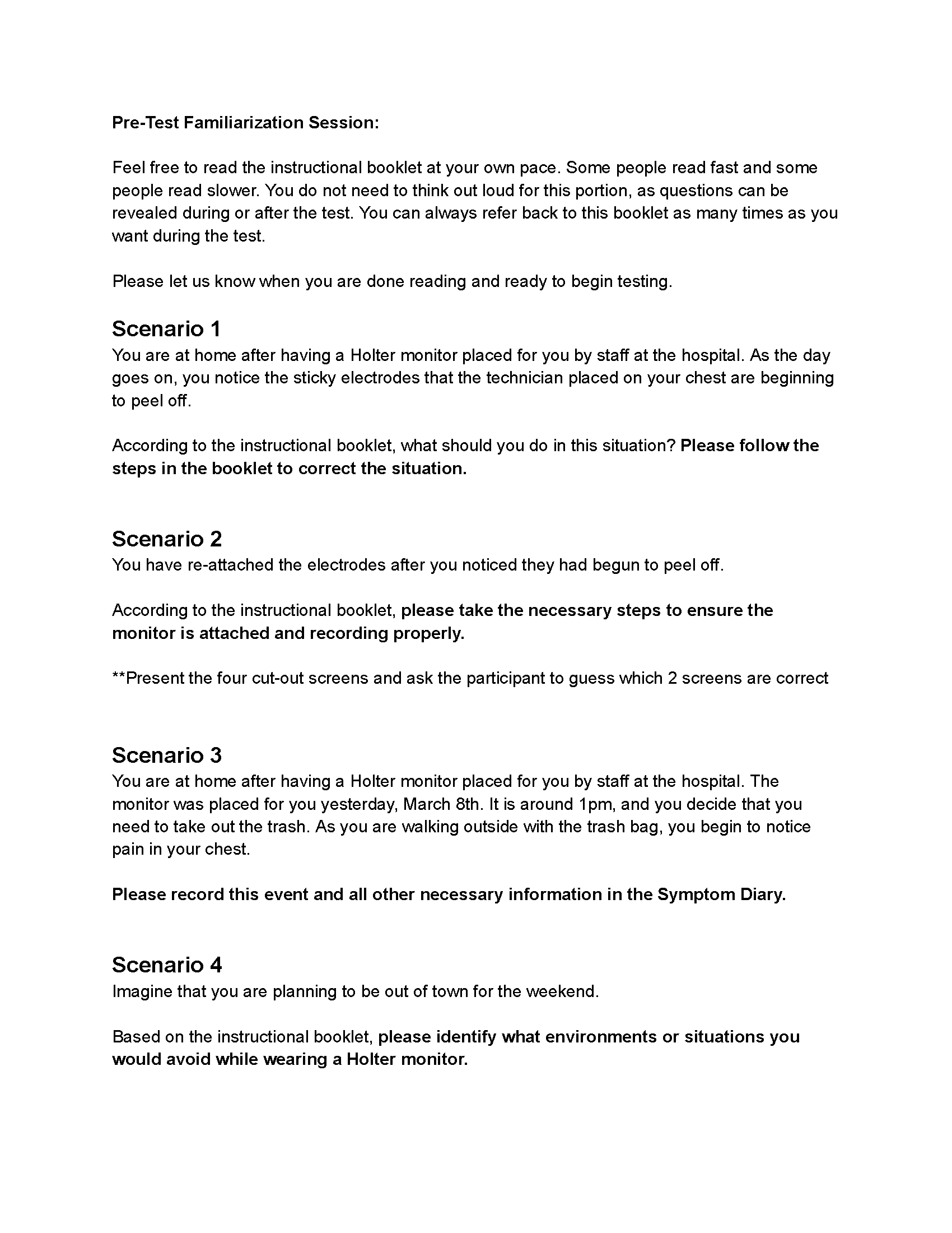
Our testing plan involved asking testers to complete a series of tasks using a low fidelity model of the Holter monitor. Ideally we would have conducted testing with the actual device, but we had some difficulties procuring one for testing purposes. Testers were given a set of scenarios, and asked to use our manual prototype and the paper model to demonstrate what they would do in each situation. We also used the think aloud method, asking testers to speak out loud what they were doing and thinking at each step. After testing concluded, we also conducted a survey with each tester regarding their previous experiences with these kinds of devices and heir thoughts on the scenarios and the manual.
“Holter monitors are definitely not meant for just cardiac patients because what defines a cardiac patient? A cardiac diagnosis? Most patients would be in for one thing but later discover it deals with all systems of the body despite coming in with a neurological problem, for example. We often use Holter monitors on our unit to rule out any underlying heart problems that could be affected by possible neurological issues.”
We also conducted interviews with the Cardiovascular Technologist who introduced this challenge to us, as well as a Registered Nurse, to better understand how Holter monitors are used and what the process of setting patients up with these devices for home-monitoring actually looks like from their perspective.
Analysis & Ideation
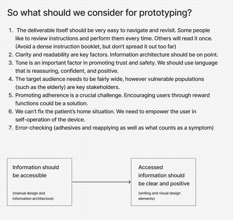
After completing our research, we compiled the information and insights by organizing it into a series of categories and flowcharts. At the end we were left with a few key considerations and actionable insights that would guide our prototype creation.

Guided by these considerations, we developed our first prototype manual in FIgma. This design went through a few revisions before we arrived at the final product. Key revisions included:
Modification to the language used. It was very important that instructions were as clear as possible, and did not use any language that might be confusing or too complicated for any patient to understand.
Images used in task steps were modified to better show proper anatomy.
Consideration for use in black and white. We wanted the manual to be usable being printed from any printer, as they would most likely be printed in a hospital or clinic setting to be given to patients. Colour printing may not be available, so any visual that was relying solely on colour was clarified with text.
Simplifying and reducing content.


While the original design somewhat lacks clarity in its task steps, we have reorganized the instructions into reapplication and checking steps, and within each created clear, enumerated steps for users to follow, each with an illustrated diagram to provide visual aid.
User Testing:
Once these revisions were made, we planned for user testing with a fairly finalized design.
We identified these four key insights from the results of our user testing. Overall, users found our instruction manual easy to follow and convenient, and felt that we included information about the monitoring process that would bring them comfort if they were a patient.
However, they noted that one of the diagrams we had included was a bit complicated. Additionally, a page describing the process of returning the device after monitoring was provided separately from the rest of the booklet, and users believed it should be included within the booklet itself.
Desk research guiding questions included:
What is a Holter monitor?
How does a Holter monitor work?
How do patients interact with home-monitoring devices?
How do patients feel about home-monitoring?
What are healthcare providers’ roles in home-monitoring?
How is information about these devices being communicated to patients?

The final product is an instructional manual to be given to patients who are conducting at-home monitoring with a Holter monitor. The manual has been designed to be printed on letter size paper, in black and white or colour, folded in half and stapled to easily create a booklet (as seen in above image).
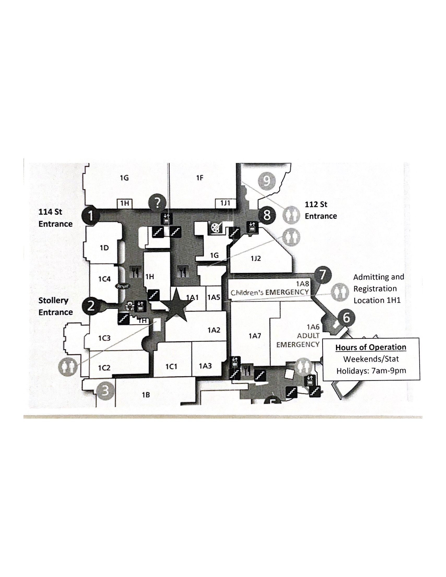
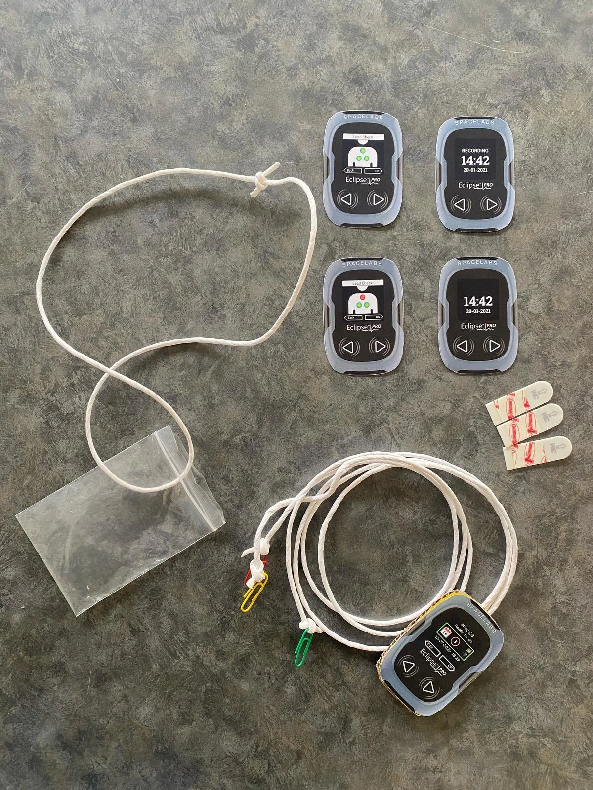
For reference, these are the existing materials being given to patients at Mazankowski
Highlights of our design:
We added to the original design some additional information for users or patients, including what the Holter monitor is, why they are being given one, and what it's purpose is. As well as a diagram explaining the contents of what they are receiving. This information is shared with patients in the hospital when they receive the monitor, but having it in the booklet as well provides reassurance for users and keeps them in the know about the process

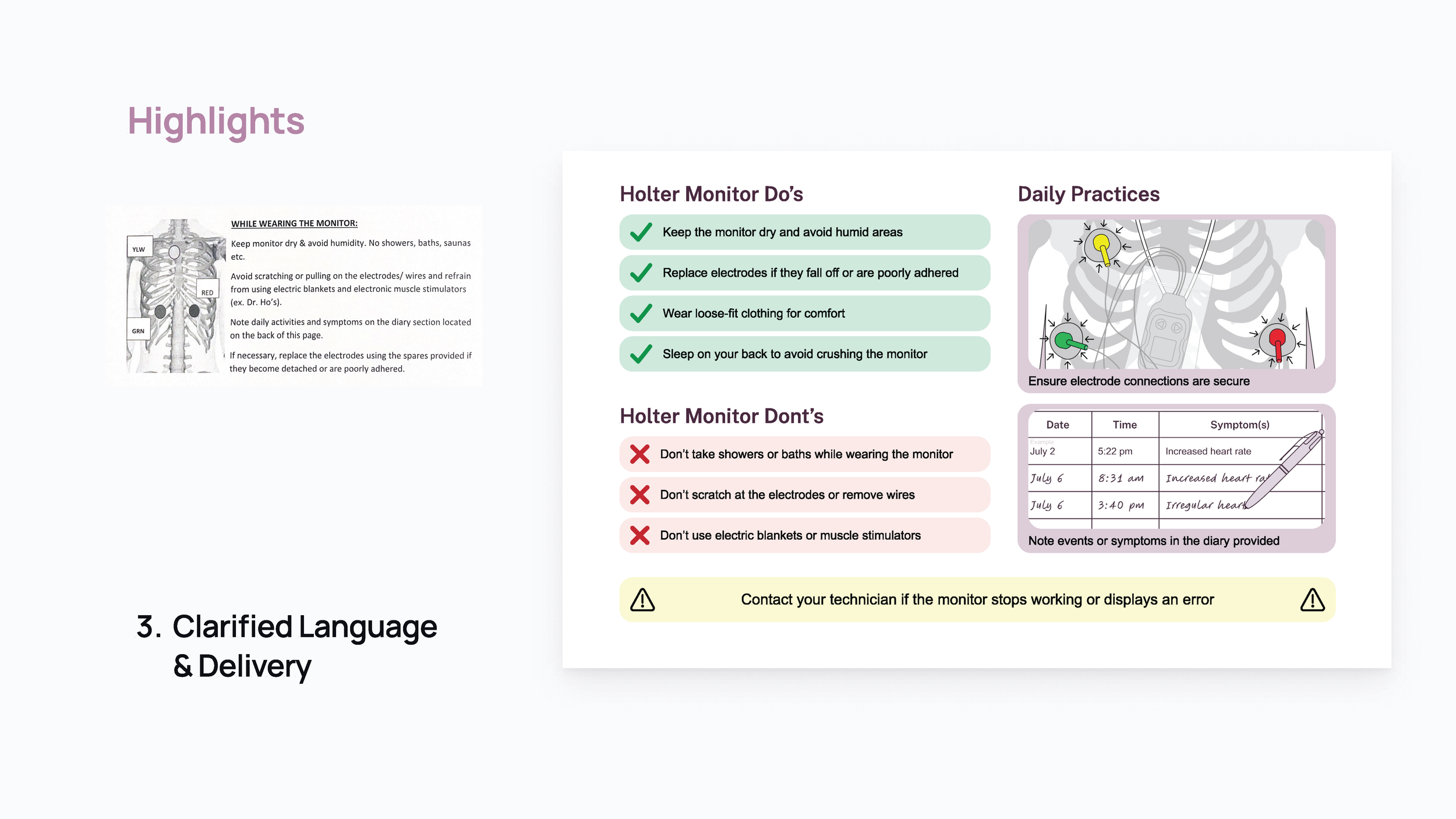
The "important information" section of the original design lacks emphasis on what should be the most important things for users to note. Our design presents "dos" and "dont's" more clearly and visually, uses relevant illustrations to highlight important daily practices for users, and clearly highlights important safety information.